Chat Software
Identity
Brief
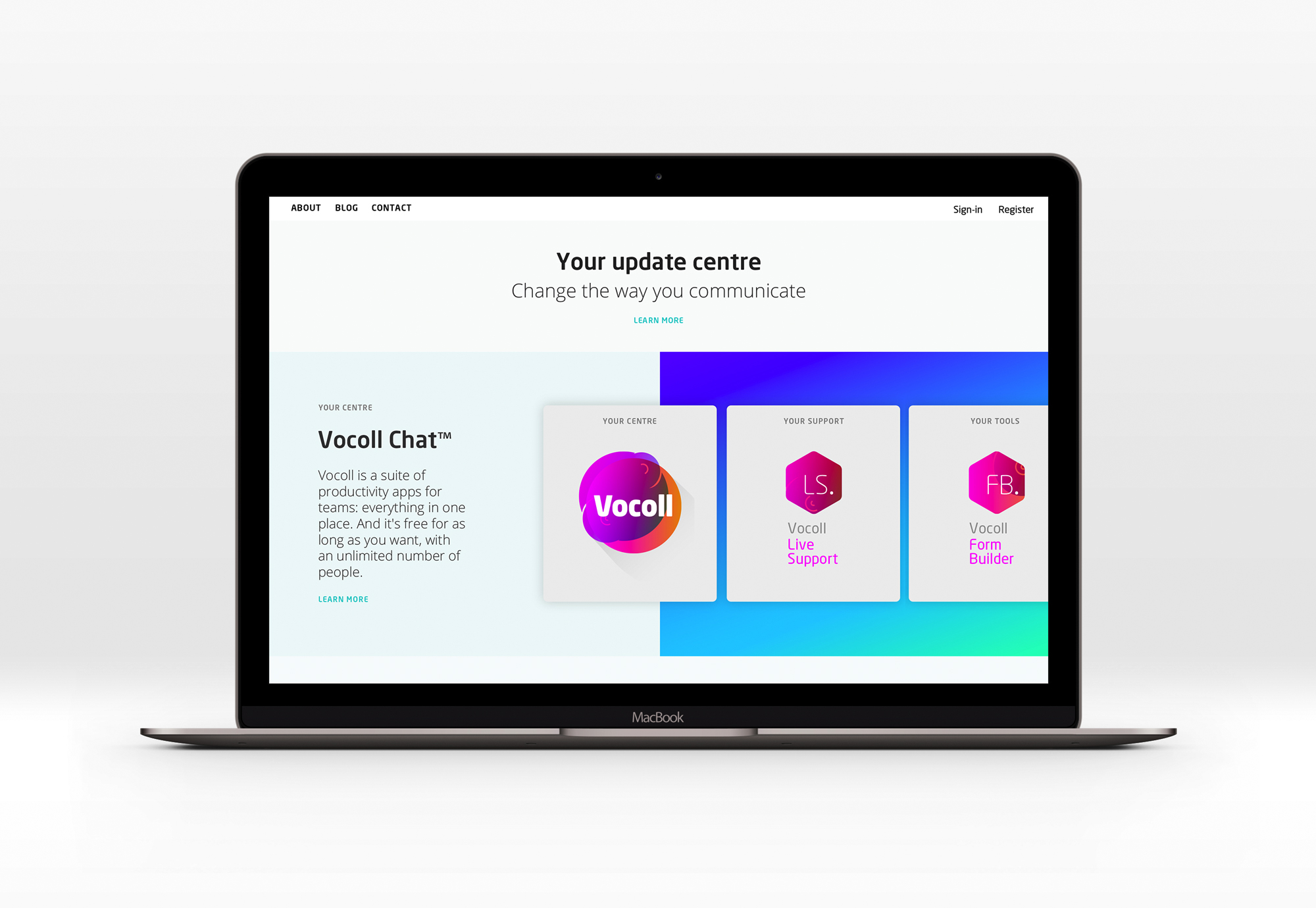
The original brief was to design a logo for chat software to be launched as a SaaS service. It would later be part of a suite of productivity tools.
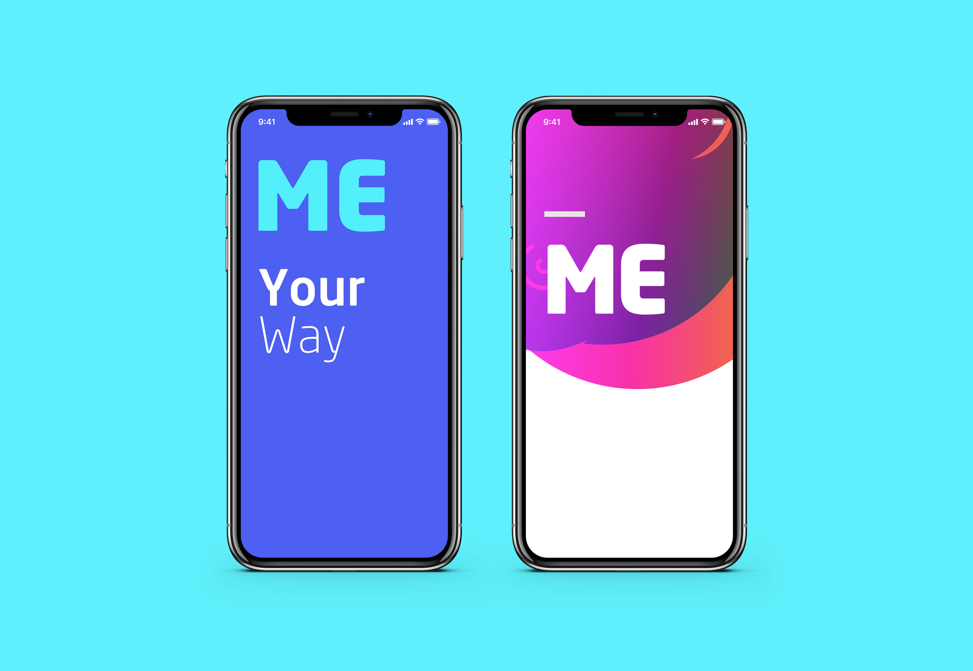
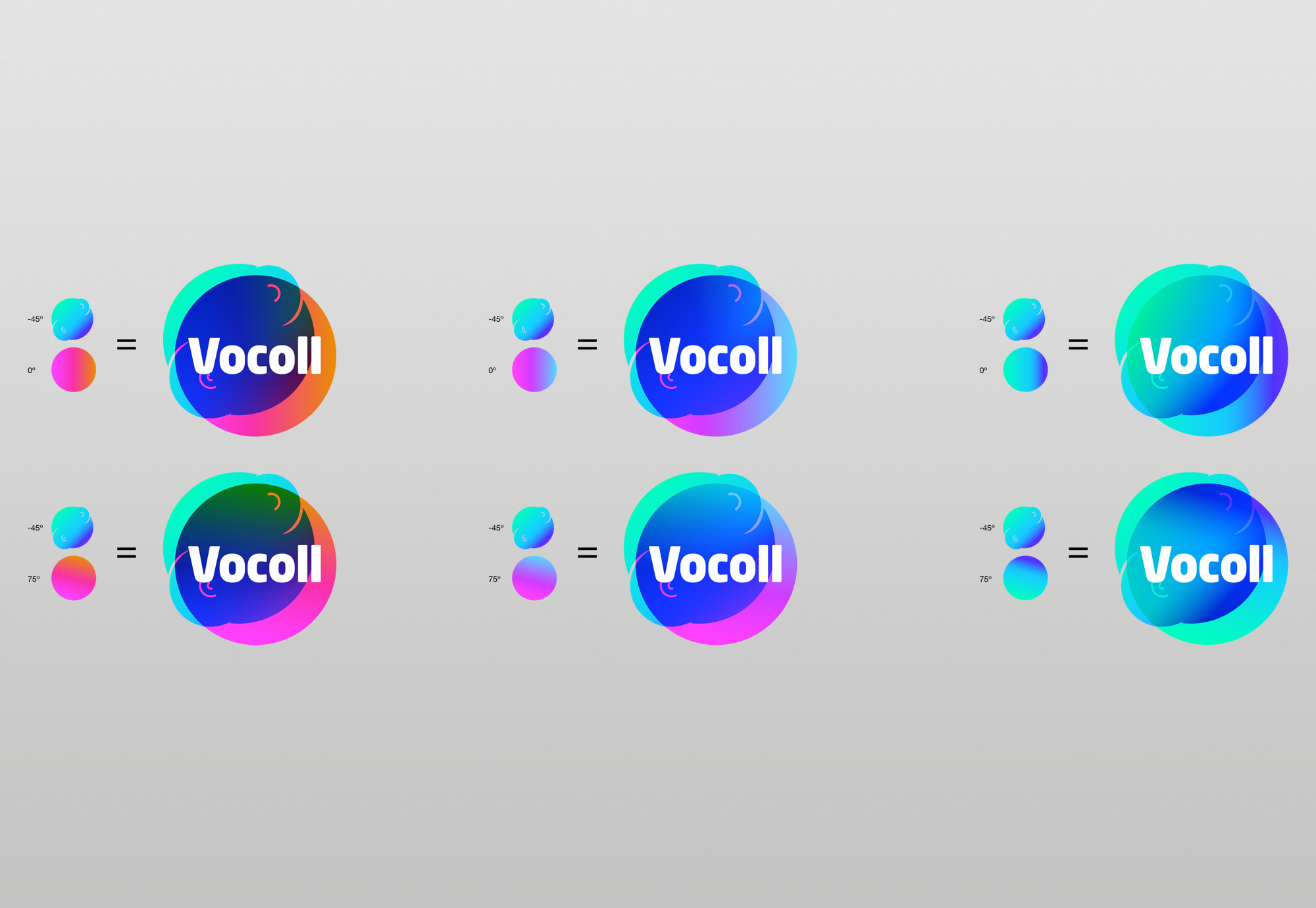
My concept was based around the idea of an identity that would be inspired by the user – to make the user experience feel fun and personal. The user could choose their own logo colour scheme, homepage, workspace colour scheme and avatar.
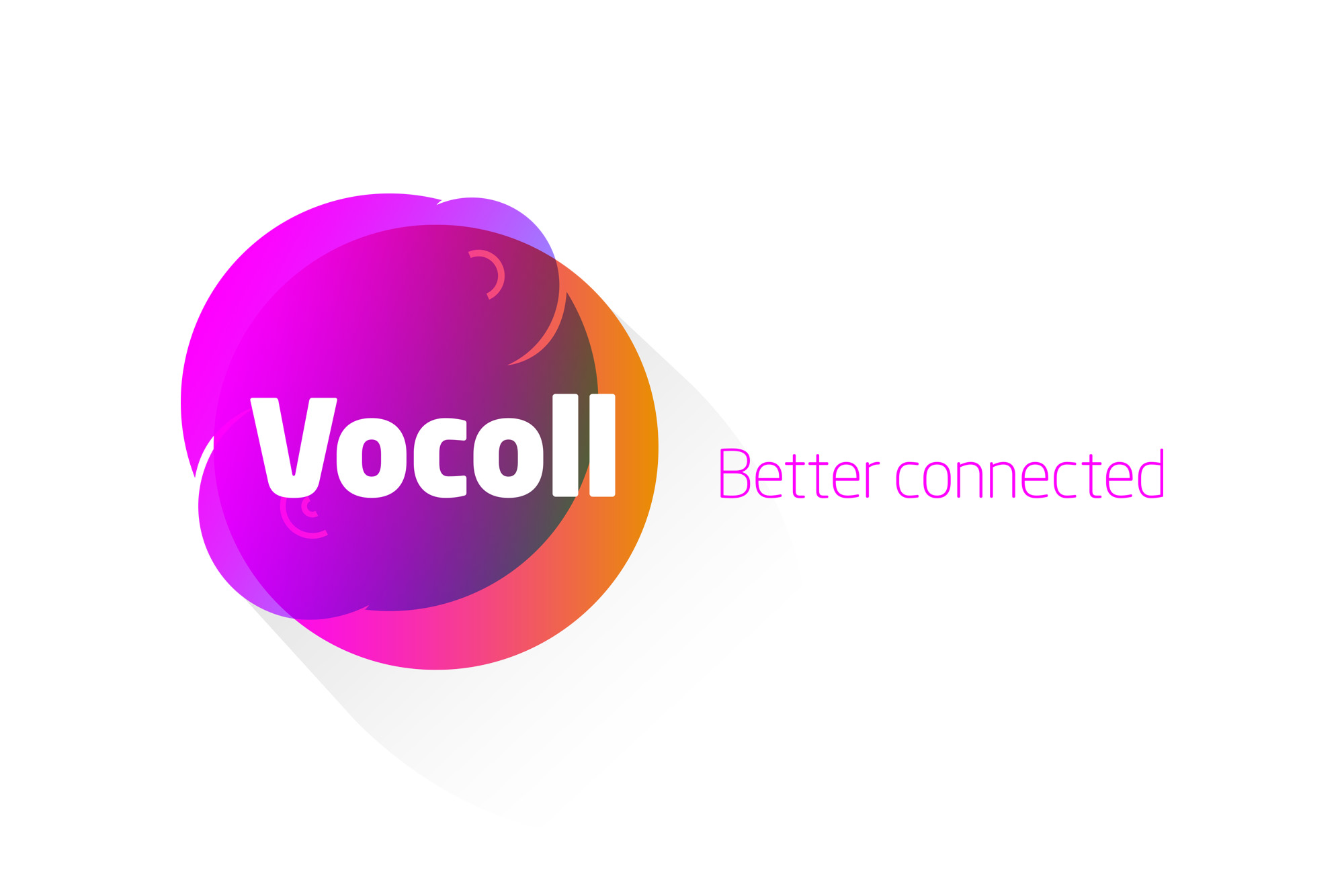
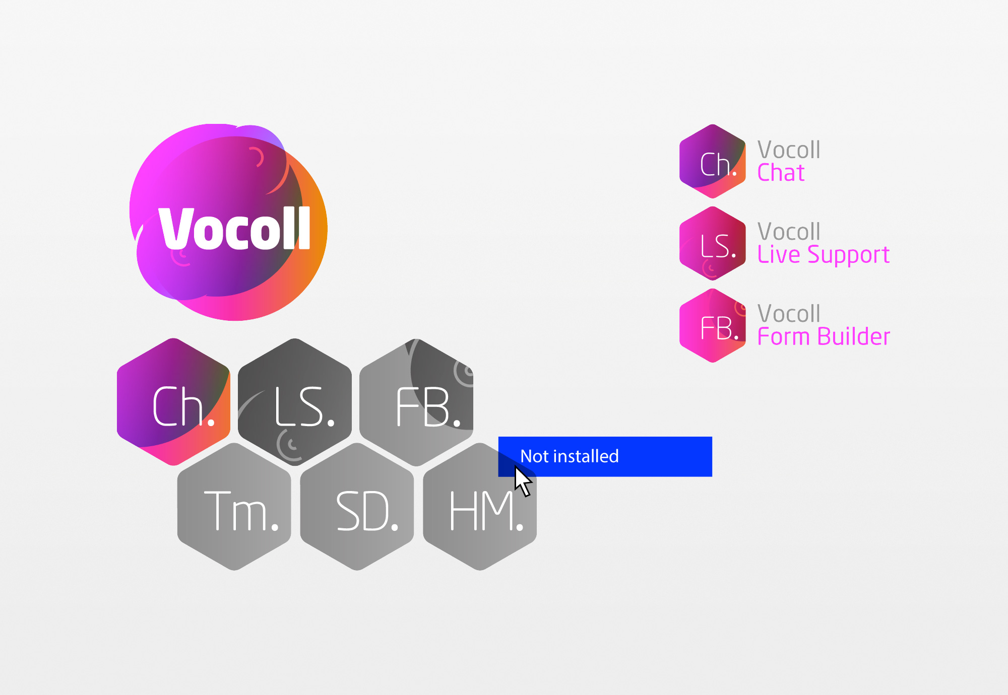
The logo shape is based on sound bubbles and echolocation shapes which represent the unique Vocoll speech bubble. The colours make full use of the RGB palette, as the primary use would be digital based.
Initial concept:
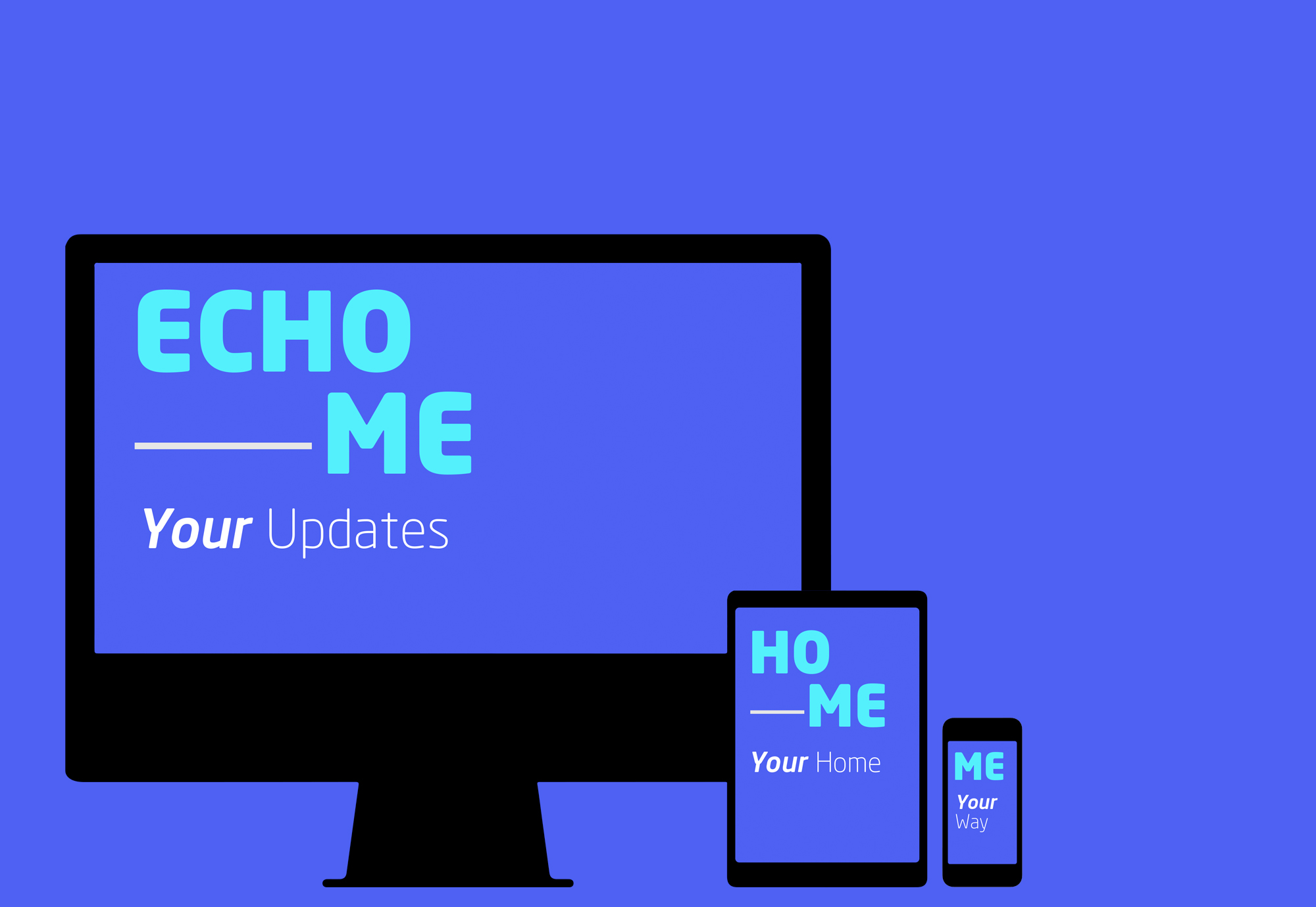
'Echo–Me'
Prior to the name 'Vocoll', the original concept name for the productivity and messaging software was code-named: 'Echo'.
Whilst using the software a colleague asked me to send a document, "Can you Echo me that file..." This vocal (*excuse the pun) request inspired my approach with the 'Echo–Me' naming and how it could be applied.
This concept places the user at the center of the software – their central hub for all project updates and status details.
Unfortunately, during the development it was discovered that the .dot com address was not available to purchase which meant this concept route was abandoned.
