
Logo Design
Brief
Logo design for a pharmaceutical Specials department within a NHS Unit.
Pharmaceutical Specials are unlicensed medicines specifically made to meet individual patient needs, e.g. if the patient is allergic to an ingredient, formulation change, strength, preservative or additive-free product based on a licensed medicine.
Objectives
- Logo to work in conjunction with the NHS brand guidelines
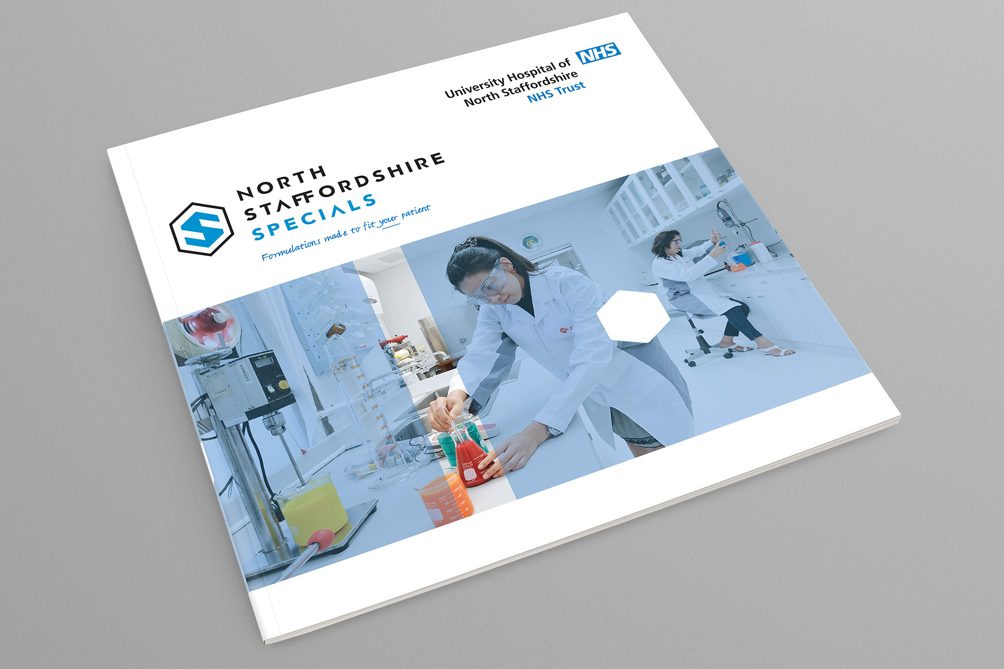
- Logo application – to be demonstrated on a brochure
- Contemporary design
- Strap line
Concept
The logo concept is based on the idea of a found quote referring to Specials, 'People are individuals. One size doesn't fit all'.
The logo features a bespoke 'S' shape that fits within a hexagon. The hexagon references a chemical structure diagram (formula). Each Specials medicine is specifically made (bespoke) and tailored to (fit) the named patient.
New proposed photography would present a more friendly, relatable and transparent service. Photography can be framed in such a way to continue the concept, e,g, 'Made to fit'. The hexagon shape can be used in flexible ways to help support the identity.