Financial and Investment Branding
Brief
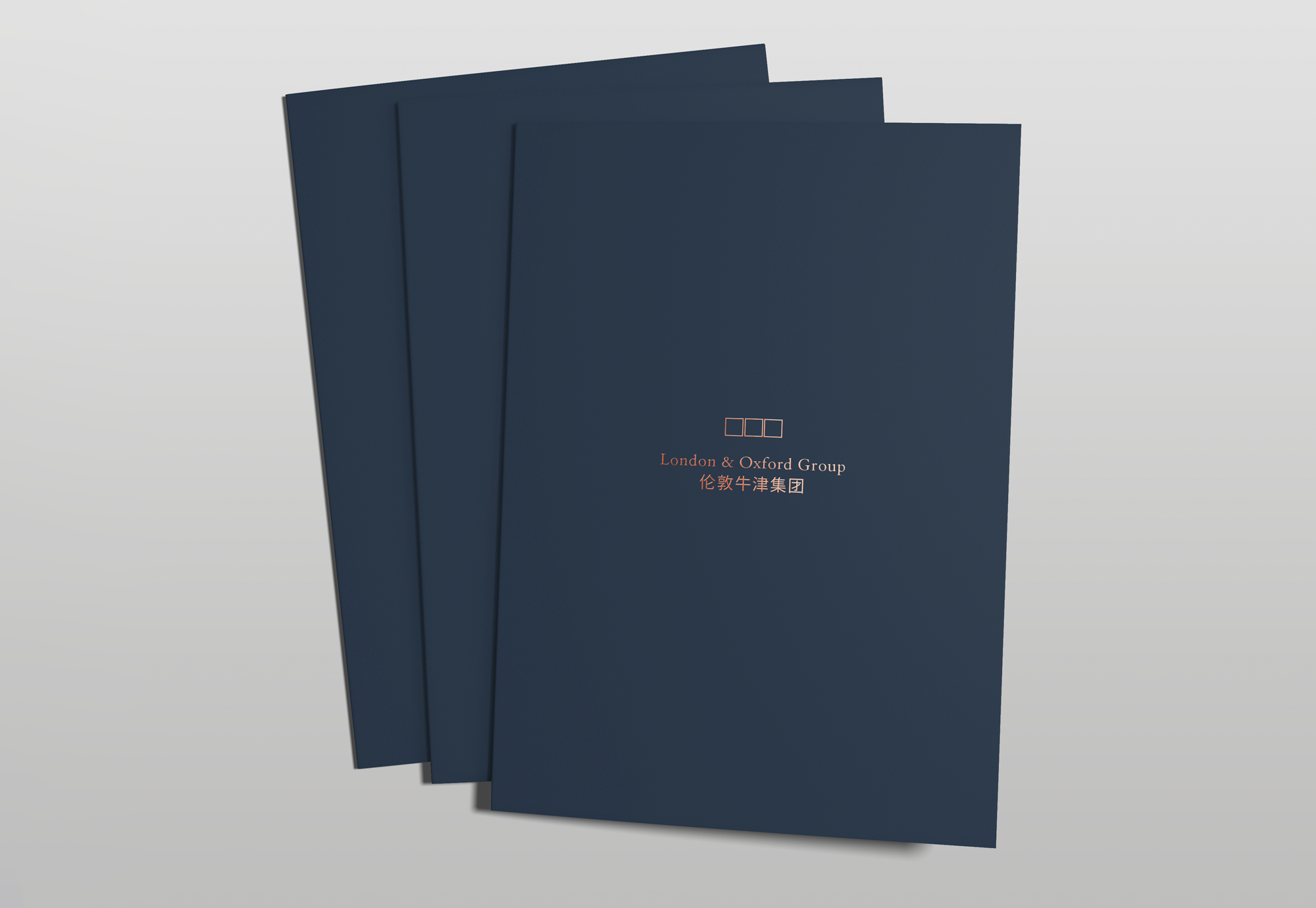
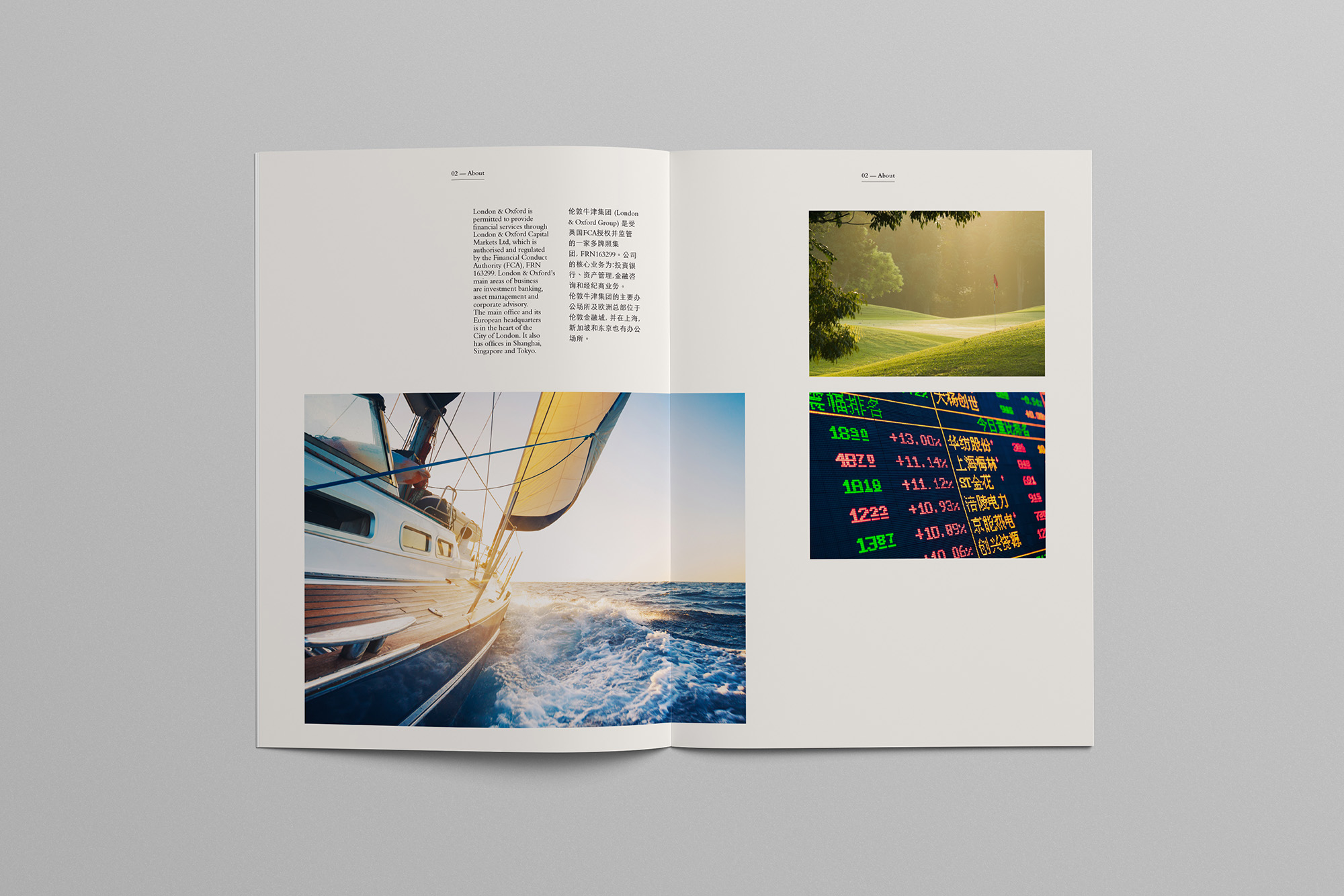
London & Oxford Group required a bilingual (EN/CN) financial investment brochure design for local and overseas investors.
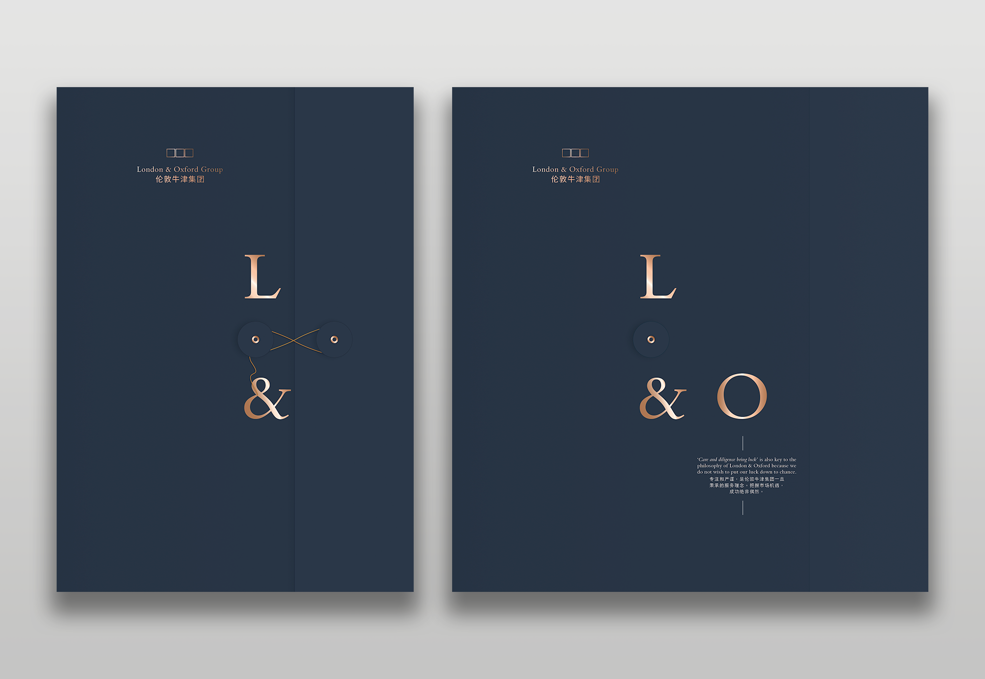
The L&O documents and contracts to be presented in an accompanying folder (custom maltese cross style).
Objectives
- Promote the London & Oxford vision and services.
- Retain, yet develop the existing London & Oxford branding.

Outcome
New font pairing selection creates balance and harmony for both languages (EN/CN), rather than one language dominating or translation appearing as an afterthought or secondary requirement.
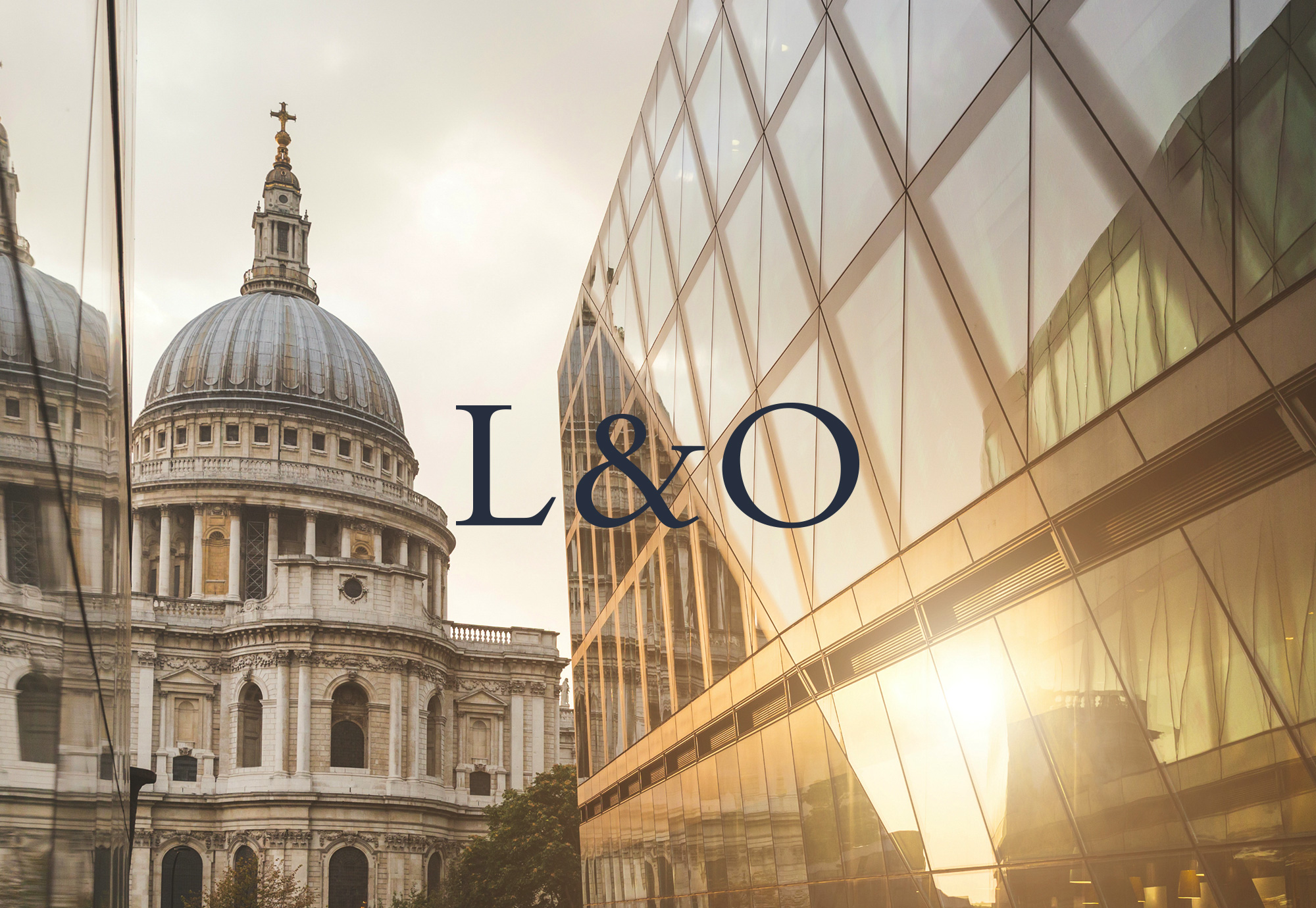
Photography selection is themed around early morning scenes, which represent the positive vision and the day ahead is filled with potential.
Due to the nature of the dual language logo lock-up, the company brand can be reduced to simply the initials, L&O. This means the branding can work in subtle ways or reduced areas, For example, in photography elements can punctuate the 'L' and 'O'.



Custom folder
Contracts and documents presented in an accompanying L&O custom maltese folder (cross style).
The L&O branding follows the punctuated method, except this time in a physical format. When the folder is opened the L&O branding is revealed and the eye is drawn down towards the L&O business ethos message.